Monday, July 20, 2015

New UI, and terrible design

Well, now that the main game of Robo-Ninja is done, other than some testing, it's time to go back and rework some of the UI using the amazing graphics that Chris sent me.

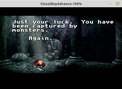
With graphics like this, it starts to look like a Real Game
Well, in doing so, I've exposed all the bad design choices I made while doing the original UI. Things that should be pretty easy are harder than they should be, based on original assumptions. For example, in my original UI, the button width in a menu automatically changed based on the text width. In Chris's, it doesn't. But based on my "clever" menu code, changing that required a lot more work than it should have.

It doesn't help that, because I'm ready to be finished with the game, instead of going back and reworking the code with the new stuff, I'm just shoving it all together in the quickest way possible. So I've got a lot of dead code that doesn't do anything, layout functions that don't make sense in the new context, etc. 

Oh well. It's going to look a whole lot cooler, and I'm going to be done with it soon.

Although it will still take awhile to do this graphics rework.  I did some searching, and there's a lot more menus and buttons than I realized.

No comments:

NES Anguna

Well, I had a little bit of time still, while Frankengraphics is finishing up her game Project Blue, to have a little downtime on Halcyon, s...